
Bismarck Magazine


Visual Identity & Editorial Design Systems
Role: Lead Designer (Brand Expression, Layout, Publication Systems)
Industries: Regional Lifestyle & Culture / Weddings / Community Publishing
-
Each title serves a different editorial mission and audience, but all three lacked unified, scalable visual systems that could give their stories clarity, personality, and cohesion — especially across recurring issues.
Key shared challenges included:
Translating diverse lifestyles, narratives, and reader expectations into a clear visual language
Creating publication templates that balance editorial freedom with structural consistency
Integrating photography, typography, and brand voice in ways that enhance — not distract from — content
Supporting print and digital contexts with adaptable, polished layouts
Across these publications, I was responsible for building design systems that balance cultural identity, editorial nuance, and repeatable structure — ensuring each magazine feels like its own brand while maintaining best-in-class publication design.
-
For each title, I led the visual design and ongoing art direction:
Layout structure and editorial systems
Typography and visual hierarchy
Page templates for features, departments, and storytelling variations
Photography strategy and integration
Color, grids, and modular systems
Print production and vendor workflows
While I did not design the original logos for all titles, I defined and extended each publication’s visual expression through systems that reinforced brand values and narrative tone.
-
1. Distinct Voice for Distinct Publications
Each magazine has a unique audience and mission. I shaped their systems to reflect this:
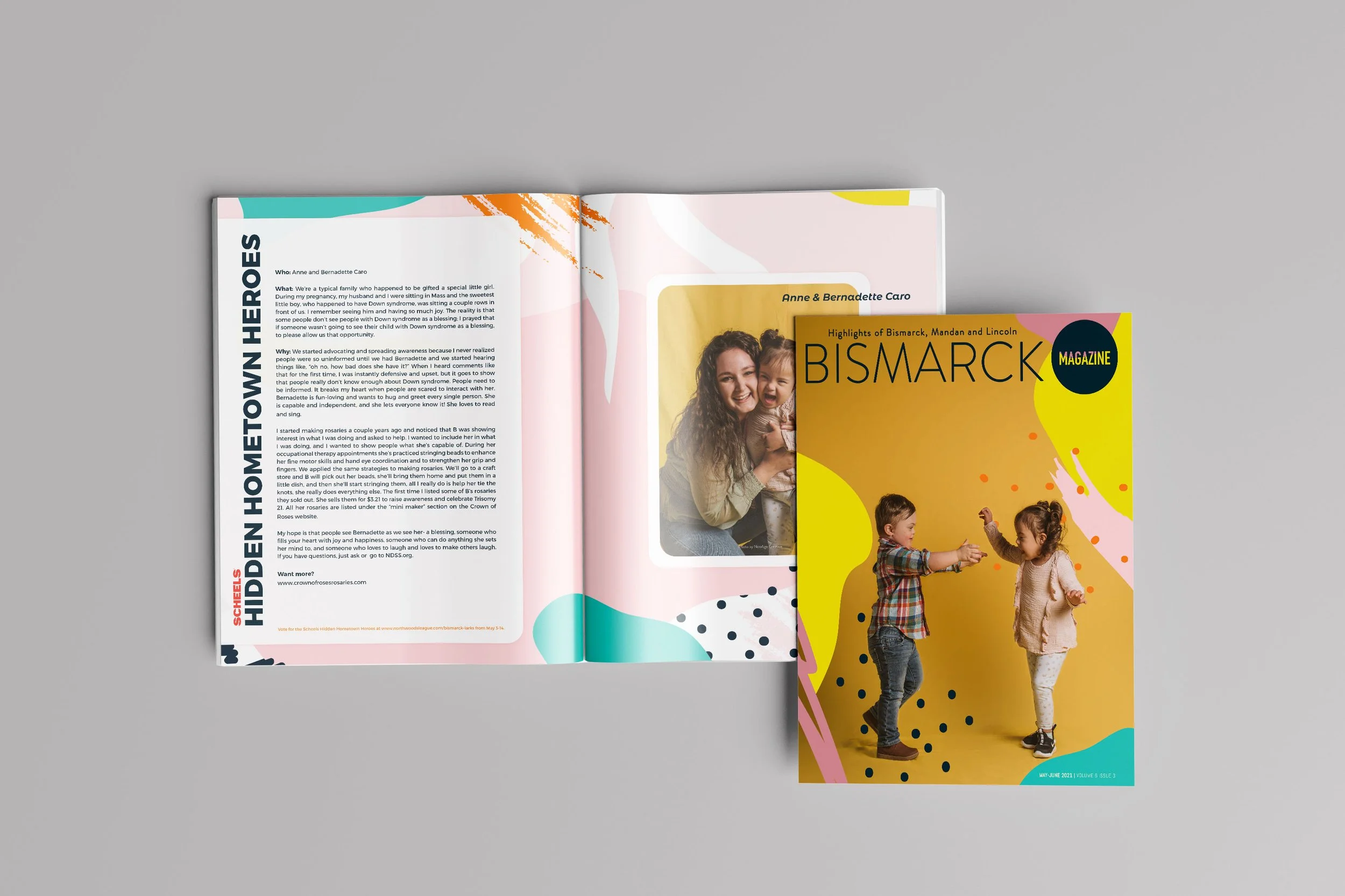
Bismarck Magazine
Positioned as cultural commentary and lifestyle authority for the Bismarck region.
Design choices emphasize editorial rhythm, balanced hierarchy, and local nuance.
Mandan Magazine
Celebrates community stories, regional identity, and local personality.
Layouts focus on warmth, readability, and approachable storytelling.
Badlands Bride Magazine
A wedding lifestyle title with emphasis on beauty, detail, and aspirational imagery.
Design leans into expressive typography, elegant spacing, and immersive visuals.
2. Modular, Scalable Editorial Systems
For all titles, I developed systems that:
Support multiple story lengths and formats
Balance feature narratives with short columns
Accommodate rich photography without compromising legibility
Provide templates that save production time while preserving design integrity
This included grids, templates for departments and features, and standardized treatments for captions, pull quotes, and infographics.
3. Typography as Voice
Choosing expressive but readable type systems was essential:
Establishing headline treatments that match tone (bold and modern vs elegant and refined)
Prioritizing readability in longform content
Creating visual distinction between departments and features
4. Photography and Pacing
Photography is integral in publishing, and my systems ensure it works as part of the story — not just decoration. This includes:
Consistent cropping and treatment standards
Use of full-bleed imagery where appropriate
Strategic white space to support visual rhythm
-
Across all three titles, my design work delivered:
Cohesive visual identities that enhance editorial voice
Repeatable systems that improve efficiency without sacrificing quality
Visual experiences that deepen reader engagement
Increased perception of professionalism and editorial credibility
Print production files that translate cleanly from digital design
Each publication now has a visual language that feels intentional, refined, and aligned with its audience.
-
This body of work highlights:
Publication design expertise across multiple titles and missions
Ability to balance editorial flexibility with design consistency
Strong typographic judgment and hierarchy control
Visual storytelling across photography, text, and pacing
Discipline in repeatable, scalable layout systems
Sensitivity to audience and brand voice