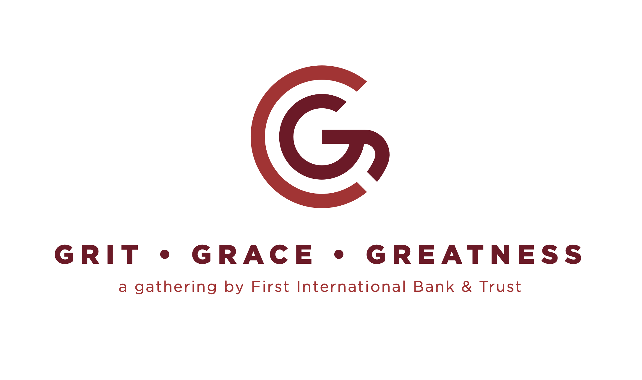
Grit, Grace, & Greatness
Grit, Grace, Greatness Brand Development
Executive Speaker Series Brand & Visual Identity
Role: Brand Designer & Visual Strategist
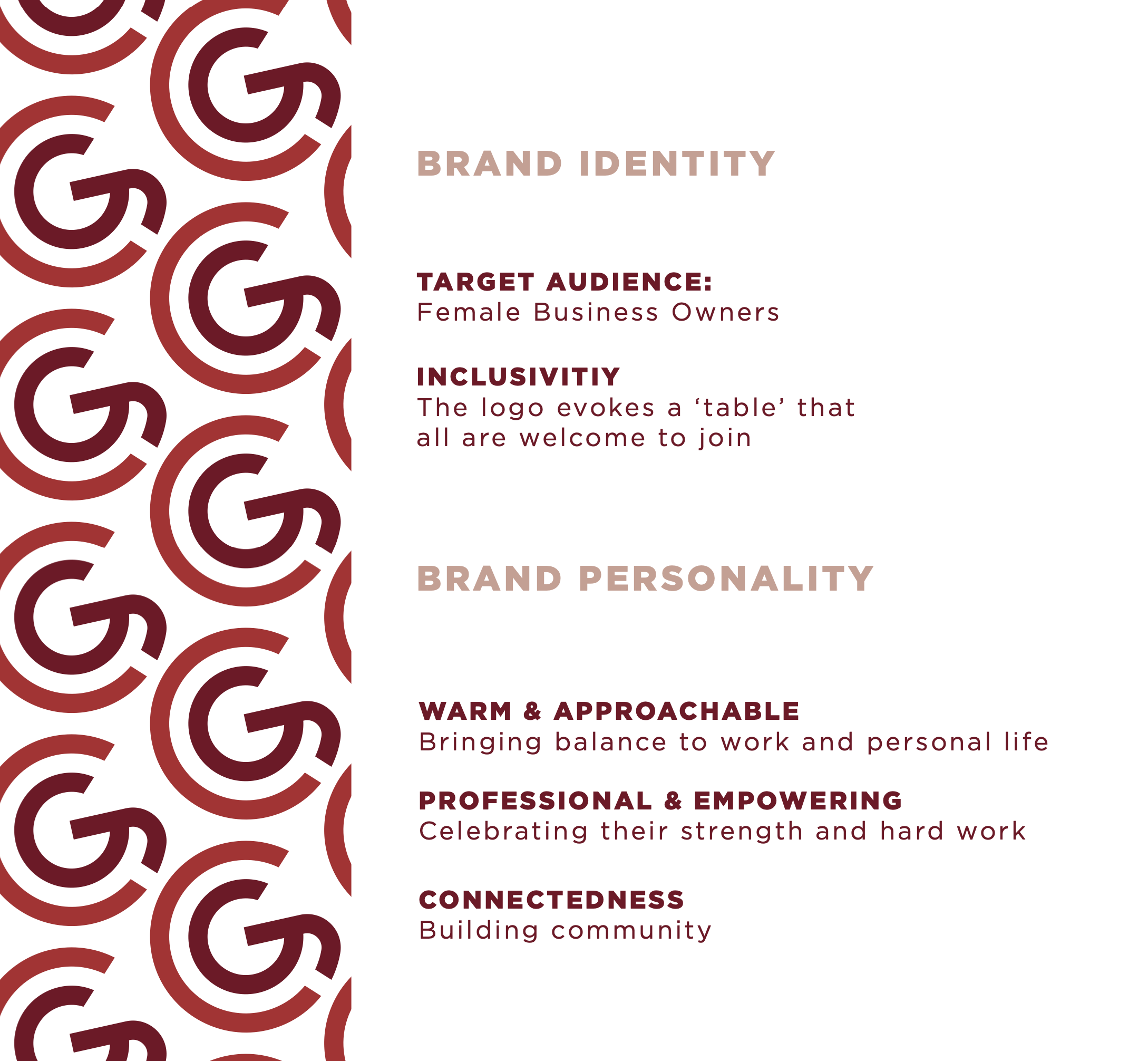
Industry: Executive Leadership / Women in Business / Corporate Events
-
Grit, Grace & Greatness was developed as a speaker series for C-suite and executive-level women — a space designed to foster leadership, resilience, and meaningful professional connection.
The brand needed to:
Reflect strength without harshness
Feel refined and executive — not trendy or overly decorative
Appeal to high-level leaders across industries
Translate seamlessly across event materials, digital promotions, and on-site collateral
Communicate empowerment with credibility
The visual identity needed to balance power and polish — grit and grace — in a way that felt intentional and elevated.
-
I led the development of the series’ visual identity from concept to implementation, including:
Brand exploration and tone definition
Logo and typographic treatment
Color palette development
Visual motif and supporting graphic system
Event collateral design (digital + print)
Presentation templates and promotional materials
Brand consistency across channels
This was a full visual branding initiative created to support a leadership-focused event experience.
-
1. Defining the Emotional Tone
The name itself carries tension — Grit (strength, resilience), Grace (poise, presence), and Greatness (impact, leadership).
The visual system was built to reflect:
Strength through structure and typography
Sophistication through spacing and restraint
Momentum through composition and hierarchy
Rather than leaning into clichés of “female empowerment,” the system emphasizes executive authority and earned leadership.
2. Typography as Leadership Voice
Typography was used intentionally to signal confidence and credibility. Clean, strong headline treatments paired with refined supporting text ensured the brand felt established and serious — appropriate for a C-suite audience.
Hierarchy was carefully structured to allow keynote names, session titles, and themes to take visual precedence.
3. Visual Identity System
I developed a cohesive visual language that included:
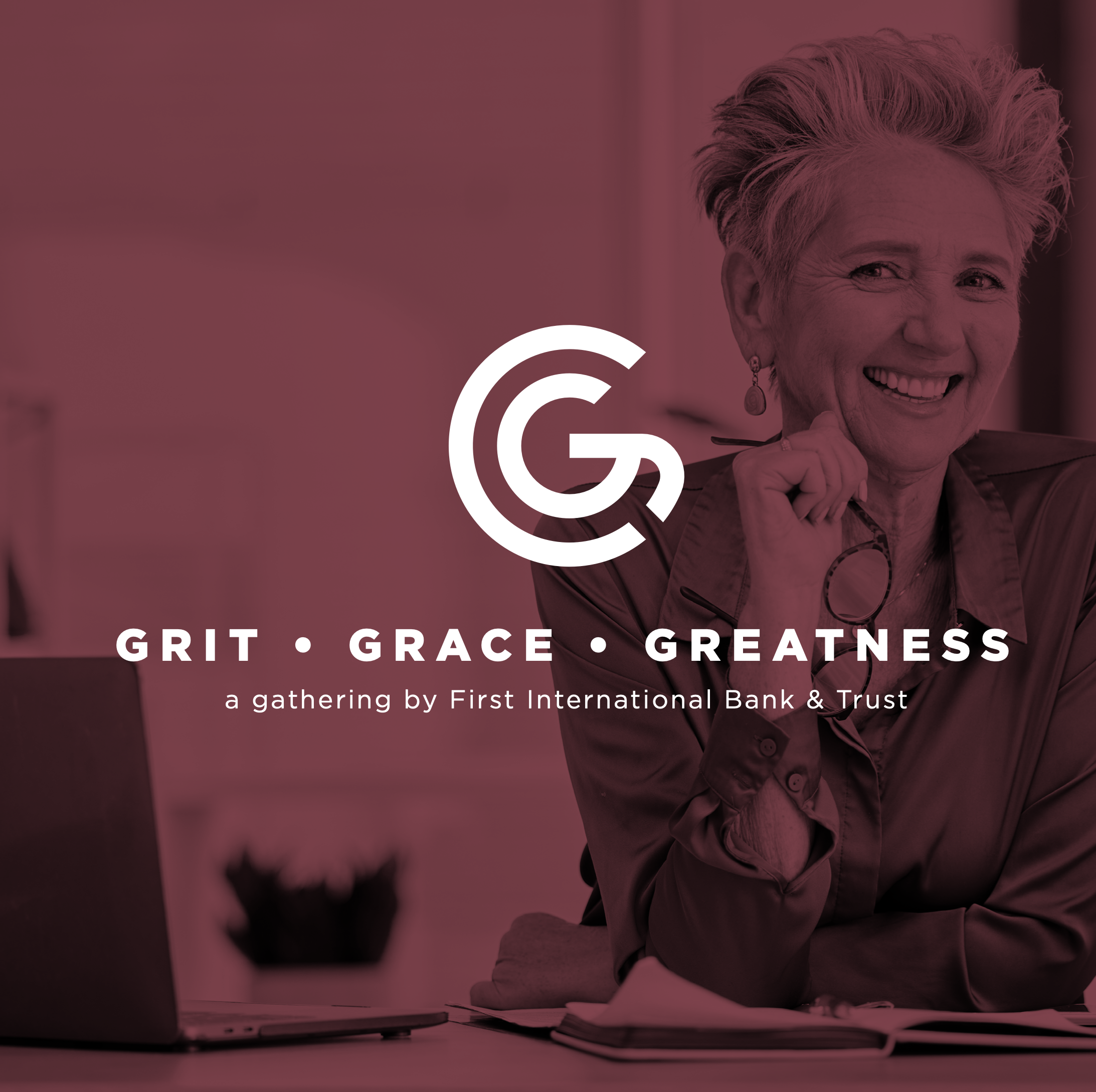
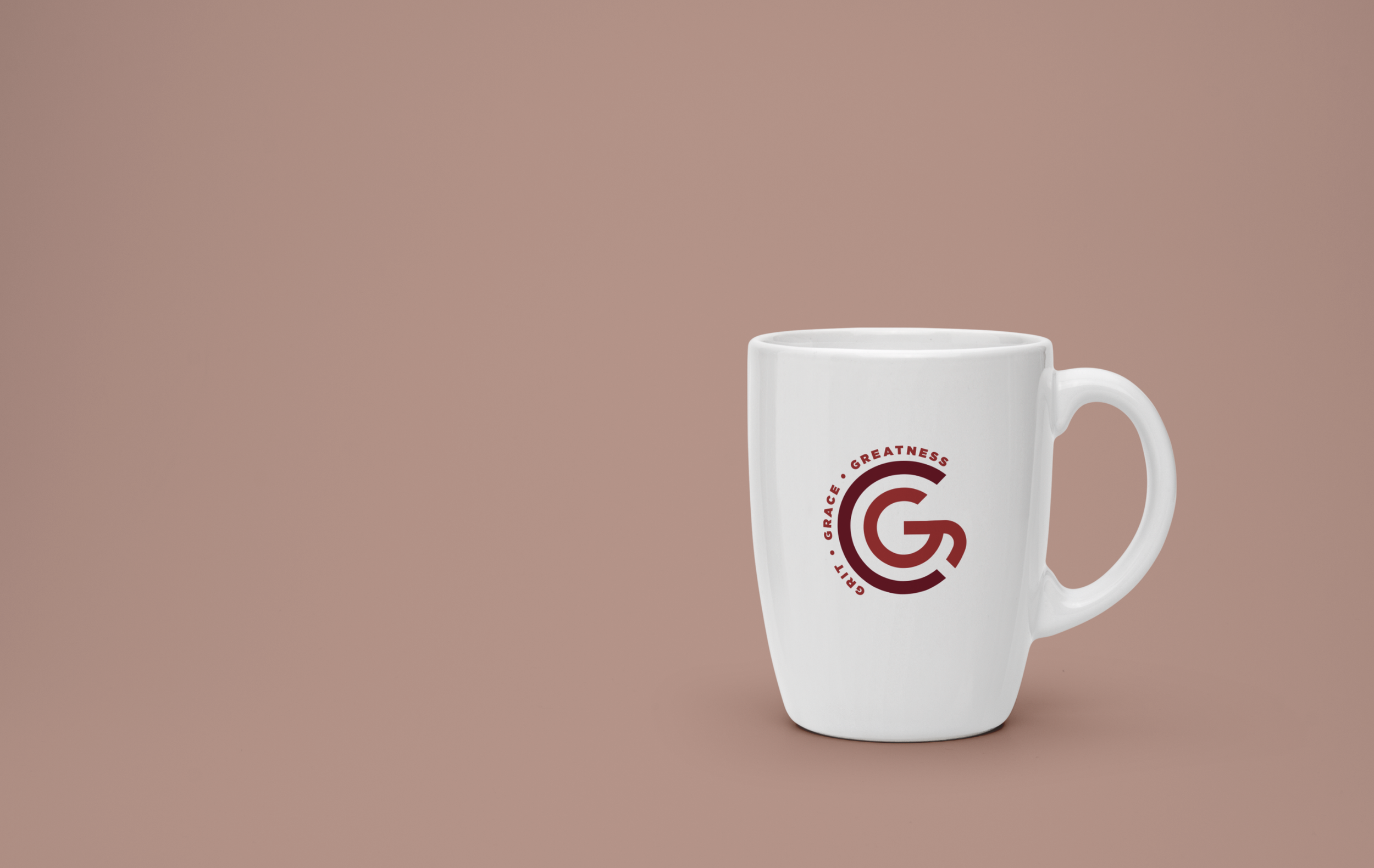
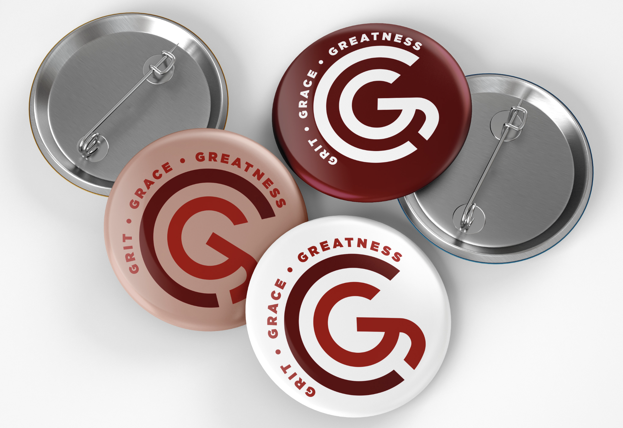
Core logo mark and wordmark
Color system reflecting depth and strength
Graphic accents that reinforce movement and resilience
Modular layouts for repeatable event materials
The system was built to scale — adaptable for future speaker series iterations and evolving themes.
4. Cross-Channel Consistency
The brand was applied across:
Event invitations
Presentation templates
On-site signage and collateral
Digital announcements
Consistency ensured that every audience touchpoint reinforced the same tone: confident, composed, and forward-thinking.
-
Established a recognizable brand identity for a leadership-focused event series
Elevated the professionalism and perceived value of the series
Created repeatable visual templates for future programming
Reinforced the positioning of the event as a high-caliber executive gathering
-
This project highlights:
Brand development for executive-level audiences
Emotional nuance translated into visual systems
Strategic typography and hierarchy decisions
Event branding and cross-channel execution
Ability to design for leadership, not just consumers