Kavinu Branding
Kavinu Brand Development
Brand Naming, Identity & Comprehensive Brand System
Role: Brand Strategist & Lead Designer (Naming, Identity, Guidelines, Visual System)
Industry: Fintech / Banking-as-a-Service (BaaS)
-
Kavinu was launched as a fintech solution redefining Banking-as-a-Service by removing middleware and providing direct access to a trusted banking partner. The product required a distinct identity that:
Differentiated it from its parent brand, Kotapay
Positioned it as innovative yet secure
Communicated credibility within a regulated financial environment
Scaled across digital, print, sales, and developer-facing materials
Supported long-term growth and product expansion
This was a ground-up brand build — from name to visual system.
-
I led the brand development from inception, including:
Naming strategy and development (“Kavinu”)
Brand positioning and narrative alignment
Logo concepting and construction
Visual identity system development
Color palette architecture
Typography system (Montserrat-based hierarchy)
Graphic element and pattern creation
Brand usage rules, do’s and don’ts
Full Brand Identity Guidelines documentation
Visual application mockups and deployment assets
This was not a logo project — it was a complete strategic brand system.
-
1. Naming & Positioning
The name Kavinu was developed to feel modern, proprietary, and scalable — distinct from traditional banking language while still sounding credible in enterprise fintech.
The positioning centers on:
Direct-to-bank infrastructure
Elimination of middleware
Speed, control, and simplicity
Stability backed by over a century of banking experience
This balance between innovation and institutional trust shaped every visual decision.
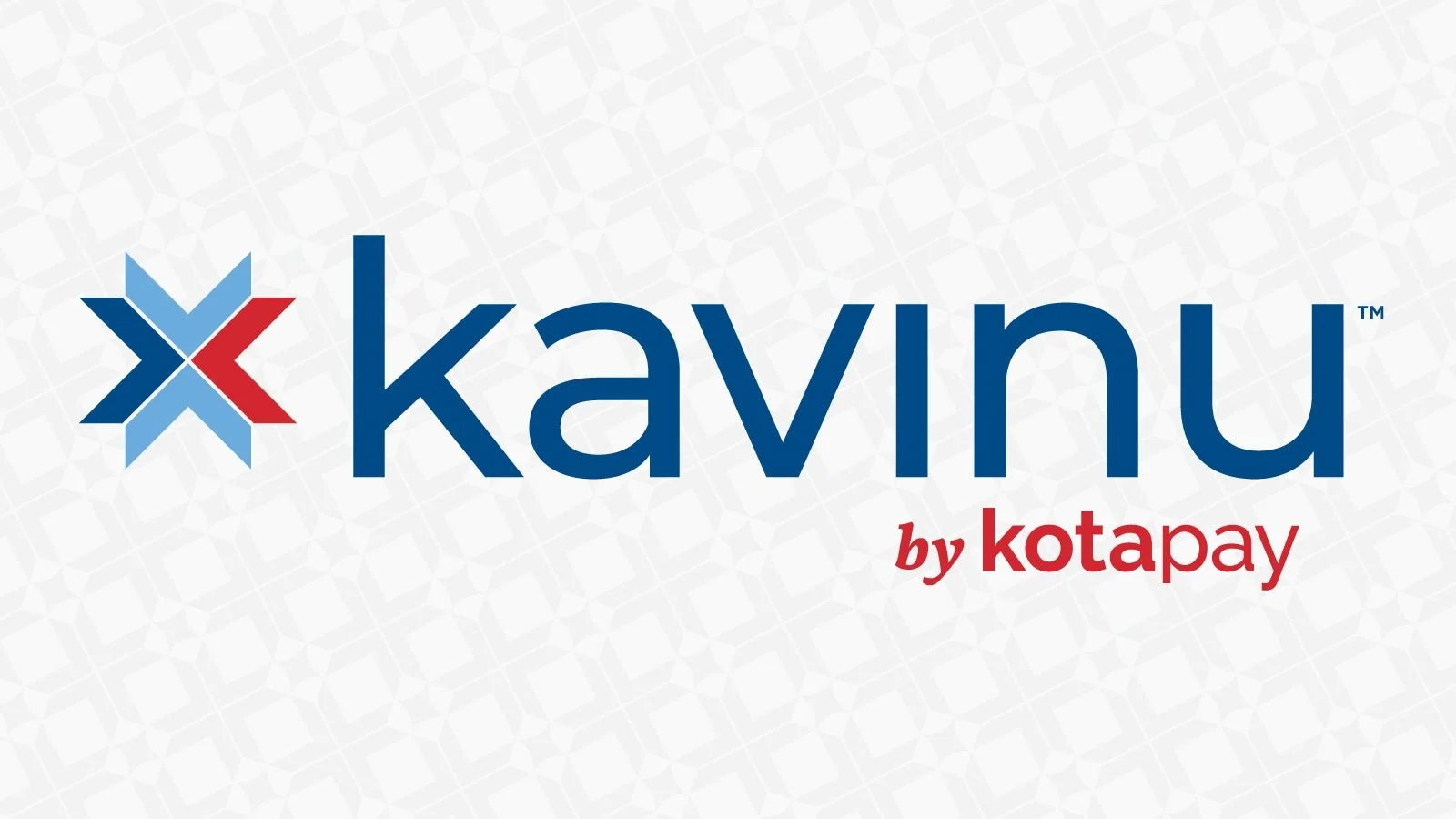
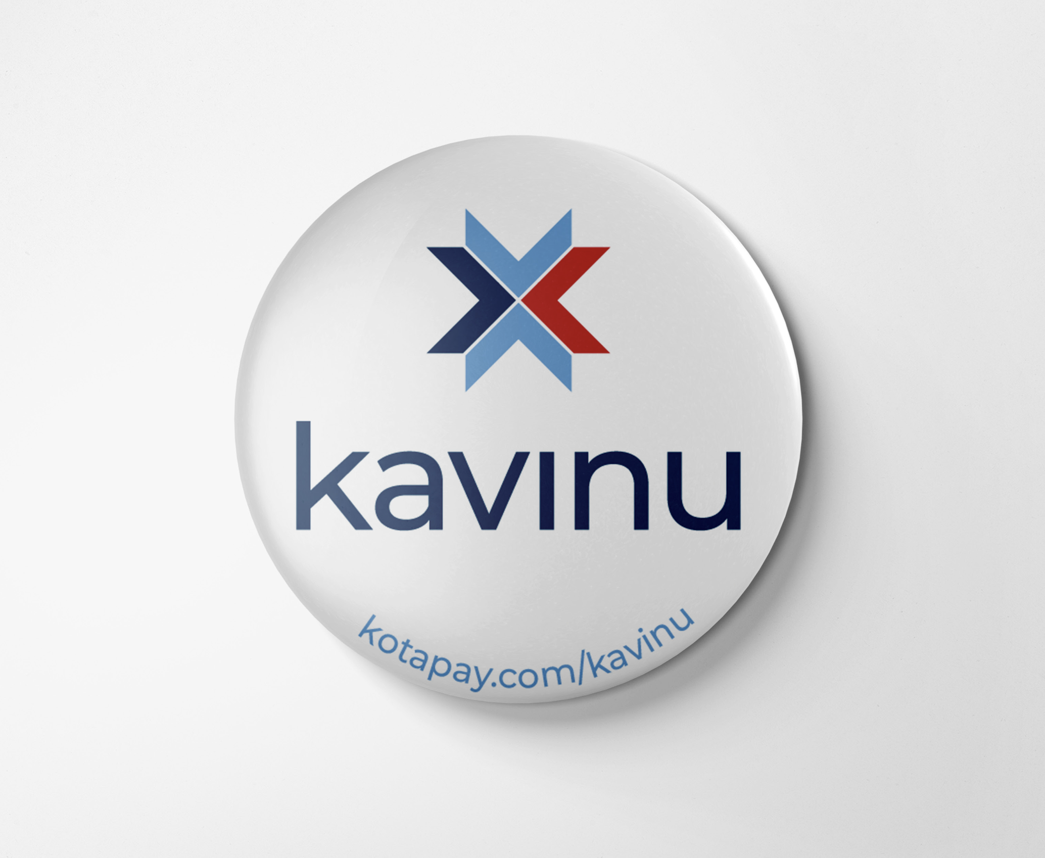
2. Logo Philosophy & Construction
The Kavinu logomark draws inspiration from:
Kotapay’s heritage
North Dakota’s barn quilt motifs (regional authenticity)
Directional movement and integration
The geometric mark creates a modular symbol that feels technical yet rooted. Detailed construction rules and clear space guidelines ensure consistent usage across applications.
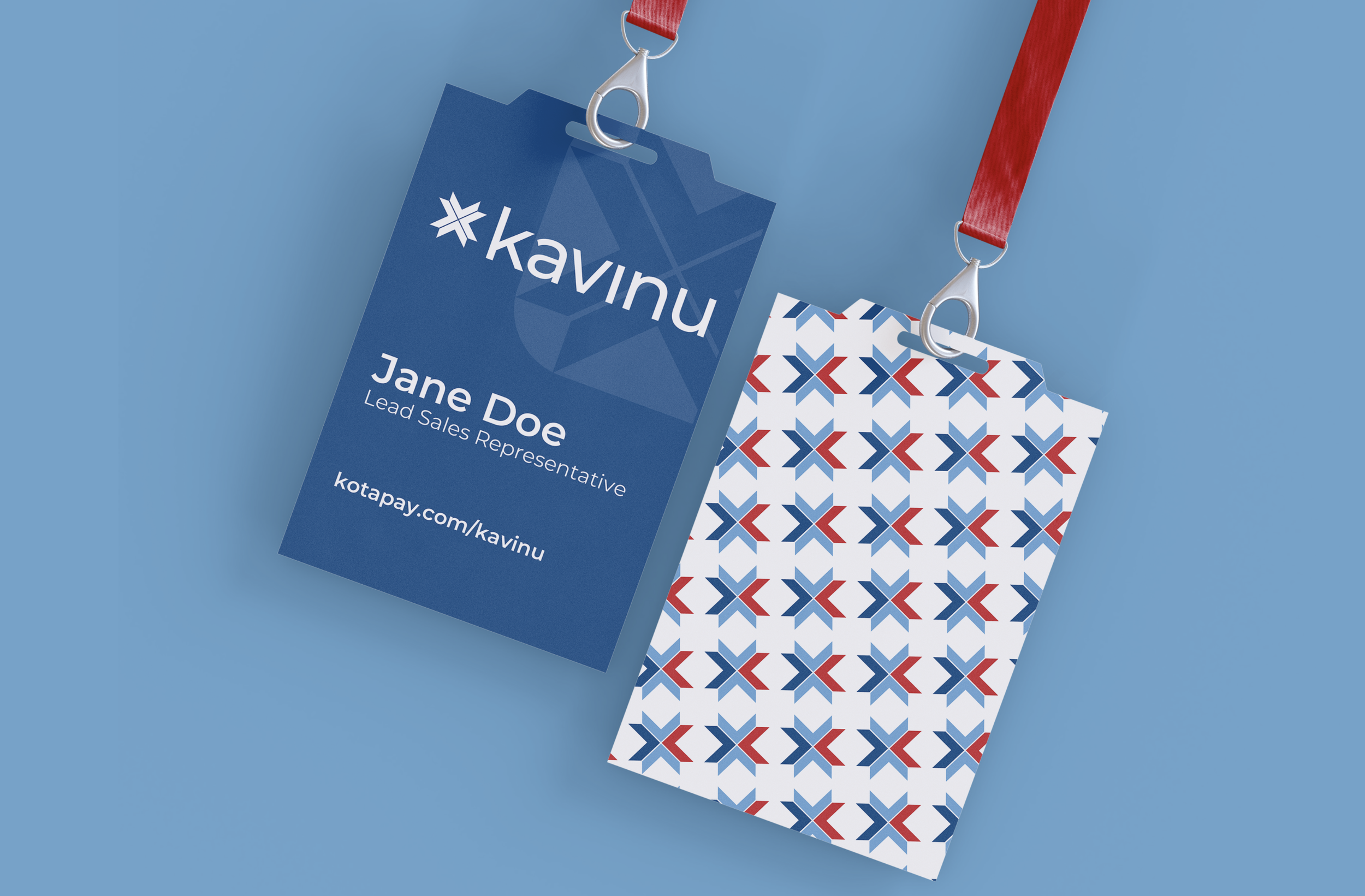
3. Visual Identity System
I developed a structured but flexible system including:
Color Architecture
Deep primary blues for stability
Bright secondary blues for innovation
Strategic red accent for energy and movement
Typography
Montserrat as the primary type system for clarity and modernity
Defined hierarchy for headlines, body, and supporting materials
Graphic Pattern System
Modular geometric pattern derived from the logomark
Used across print collateral, digital backgrounds, and branded materials
4. Governance & Brand Protection
A strong fintech brand requires consistency. I developed:
Clear usage rules
Logo sizing and color controls
Do’s and Don’ts documentation
Application examples (badges, envelopes, ID cards, etc.)
This ensured internal teams and partners could scale the brand without dilution.
-
Established a distinct fintech brand within a regulated banking ecosystem
Created a scalable identity system used across marketing, sales, and digital channels
Strengthened differentiation within the BaaS space
Provided structured guidelines that support long-term growth
Positioned Kavinu as innovative while anchored in banking credibility
-
This project highlights:
End-to-end brand creation from naming to governance
Strategic thinking in fintech and regulated industries
Ability to balance innovation with institutional trust
Development of scalable identity systems
Strong documentation and brand system discipline
Regional nuance integrated into enterprise design